Welcome to EleganceStudios.com. This site is for adults only. Please proceed only if you are at least 18 years of age.
Custom Movies and Photosets
Feature Films
Tutorials
View Shopping Cart
To restart a download, go to your Order History
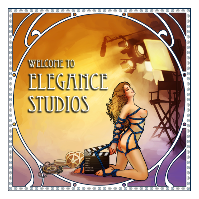
Every so often, maybe once a year or so, the Restrained Elegance community gets together and we try to make a long, ambitious feature film. We try to have good locations, more actors than our usual budgets allow, detailed scripts, props, and more people around to help out on the crew. We try our very hardest to make feature films which look like Hollywood blockbusters. We call these our Elegance Studios Feature Films.
We don’t make it of course- there’s no way a handful of enthusiasts with a spare weekend can compete with a team of hundreds of professional film-makers with multi-million-dollar budgets. But if you take a look, we think you’ll be amazed by how much you CAN do!
We’ve uploaded the films here so you can enjoy them and hopefully get inspiration. We’d love to see you come to the British Fetish Film Festival and find out how to shoot in this more cinematic style- and show us some of your films, too!
If you’ve got lots of exciting fetish ideas and storylines bumping around your head but you don’t think you can make them into films or photostories yourself, why not contact us for a custom shoot? We can help you take your idea from a story outline or a vague image in your head all the way through to an indie film which you won’t believe could be shot on such a tight budget. The Pony Girl series is a great example of what we can do for you, this started life as a custom video request (and has now taken on a very lively life of its own).
If photography is more your interest, we can shoot custom photo stories as well of course.
If you’d like to get started with fetish photography or film-making yourself why not check out our tutorials? In collaborative small-group sessions or one-on-one tutorials we will share what we’ve learned in 15 years of professional photography, show you how to get started safely, do the basic tying or concentrate on whatever technical aspect of lighting or camera-work most interested you.
And why not check out our forums for discussions on fetish ideas, suggestions for stories you’d like to see us shoot, techie talk about camera gear and techniques, general chat about bondage, BDSM, and other fetish interests, or post some of your own work on our showcase section? We’d love to see what you’ve been up to!
You can also read Hywel’s Blog and join in the discussions on the Forum. To post comments on my blog or post on the forum you will need to register for the discussion area– this is free and separate from any paid membership of the website members’ areas.
If you have any problems, please open a support ticket or email webmaster@restrainedelegance.com