Hi Everyone
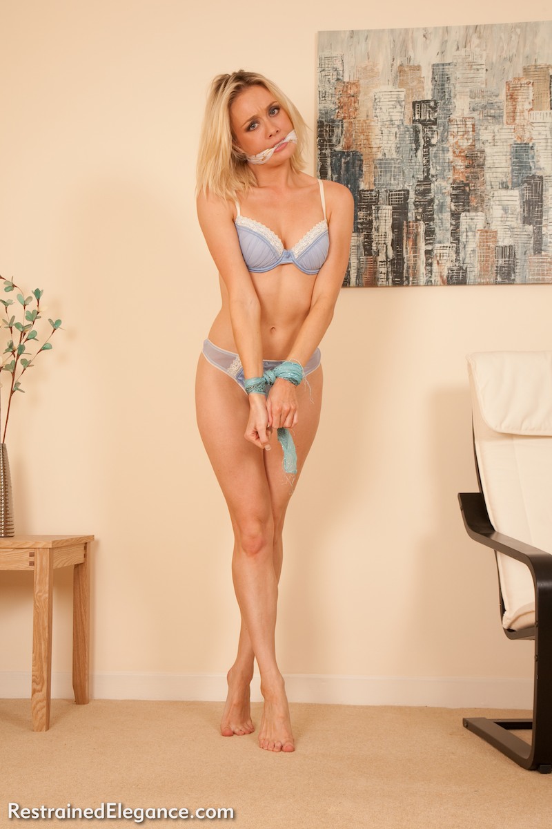
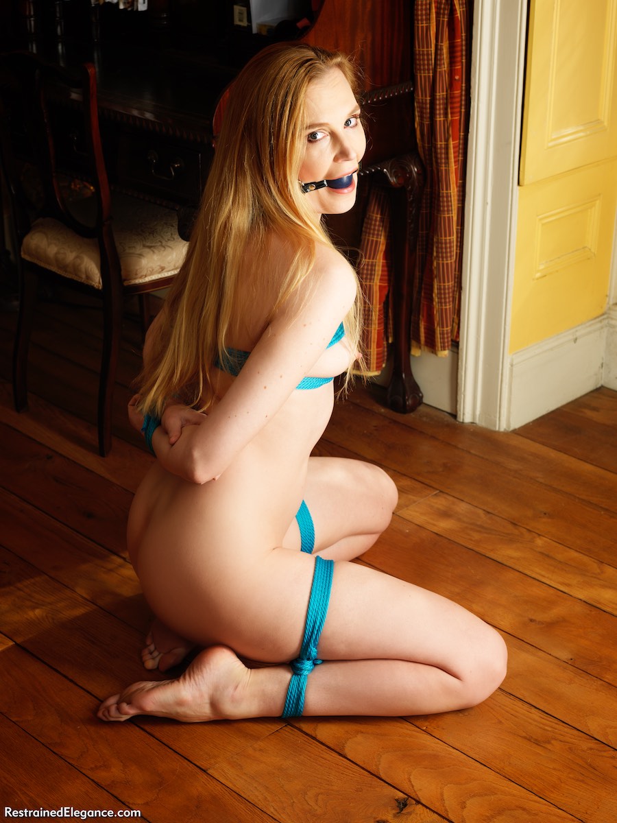
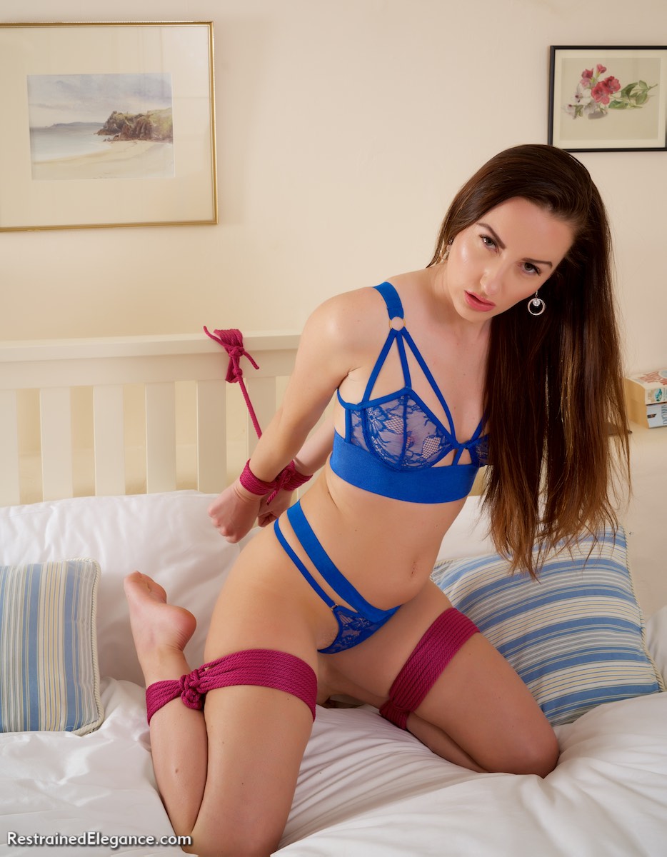
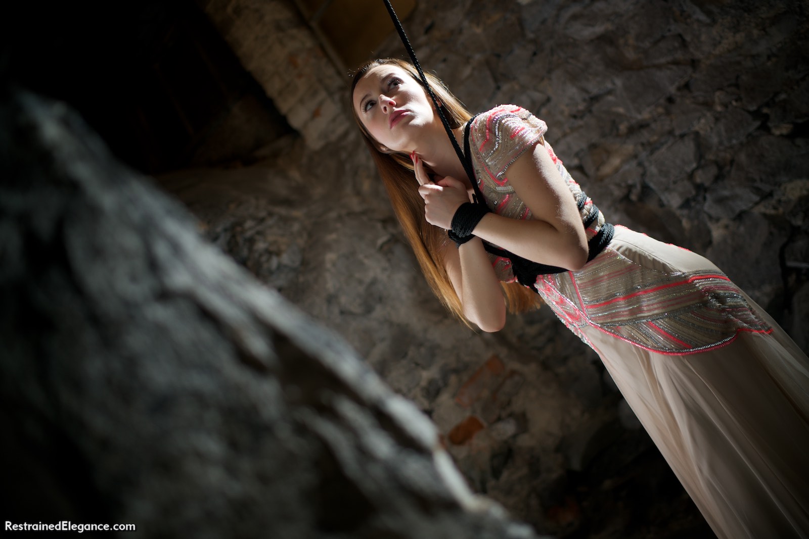
Ariel’s Blues
Somehow I managed to create a duplicate of the “Ariel’s Blues” set in the RE archives last week when I added the link to the shopping cart page for the set. this resulted in a php error trying to access the set. Should now be fixed, apologies, many thanks to John for drawing it to my attention!
OnlyFans
In general news, you may be aware of an upheaval going on in the internet adult industry at the moment. Mastercard, under pressure from various less-than-honest “anti-trafficking” groups, have put in place restrictive new rules. Fortunately, this should not affect us here on Restrained Elegance and Silk Soles – as luck would have it our record-keeping and model release system is already largely compliant, and we don’t have the issue with third-party posted content that platforms like Clips4Sale and OnlyFans have.
(On a strict reading of the rules, they would have to employ human beings to check EVERY bit of content and in particular EVERY live stream to make sure it was not in violation of the rules – something that’s obviously impossible unless they are going to hire 10% of the population as full-time porn watchers. This is a standard not demanded of any other platform – YouTube or Facebook can’t manage it with some of the biggest businesses in the world, so sites like Clips4Sale and OnlyFans clearly cannot.)
Clips4Sale have behaved pretty well during this. PLENTY of information, lots of support, clear guidance for producers and performers and reassurance on things like privacy policies (because we don’t want to be uploading the full ID’s of every performer we’ve ever worked with without some assurances that their data security is up to it- in fact if producers in some countries do that they’ll probably be in violation of their local data protection laws). I’m spending this week uploading all the recent content to Clips4Sale before the deadline to file ID and model releases for each new clip, so that I will have a sensible workflow going forward without a huge overhead for legacy stuff.
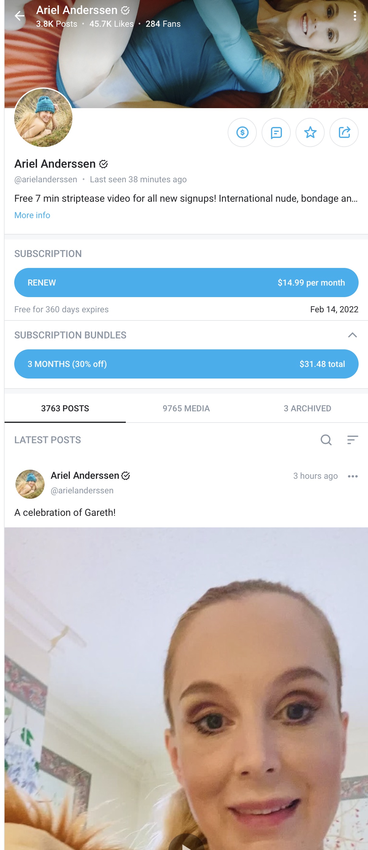
OnlyFans on the other hand have catastrophically blown it in terms of their handling of the situation. Creators found out about it from OnlyFans announcing stuff to the press, not to them. They then issued some contradictory statements, finishing with an amazingly gas-lighting tweet about how they value sex workers – which is pretty hypocritical given that they have NEVER promoted any sex workers on their twitter feed, ever. Their new rules are also much more stringent when in comes to sexual content – masturbation will be out, for example. Needless to say, that nukes a hell of a lot of models’ OnlyFans content. So there’s a huge upheaval going on – Ariel is deciding which platforms to transition to whilst making sure she delivers everything she promised to her current OF subscribers. I know many of our other regular models are doing likewise.
Please support the models while they make these transitions- if you subscribe to their OnlyFans, please stay as a subscriber until they know what platforms they will be transferring to, then follow them there.
One thing that IS positive about this is that I think MasterCard, OnlyFans, and the dishonest evangelicals pushing the “trafficked women” narrative have been taken by surprise by the fact that 95% of the press coverage is supportive of the sex workers. That’s not what happened when they pulled the plug on PornHub’s billing and I don’t think they were expecting it. There are a few differences this time around. The first is that PornHub facilitated piracy on an industrial scale with notorously poor standards for getting it taken down, no requirement for verification for uploads (because they pretended we were all coolz uploading our own personal sex lives, rather than it mostly being pirated stuff). OnlyFans on the other hand has been requiring proper verification for all content uploaders since day one. Second, PornHub was rightly synonymous with the tackiest uploaded pirated porn, whereas OnlyFans is all about empowered sex workers sharing their own content – and everybody knows it. Thirdly, and perhaps most importantly, the journalists writing about this stuff made contacts with sex workers during the PornHub push, and so have people to talk to to get our side of the story. The evangelicals are not getting it all their own way this time, because everyone can see that what they are doing is nuking the safe space that sex workers have built into a multi-BILLION dollar platform. OnlyFans is famous for girls getting their tits out and getting paid for it, frankly, which is VERY different from the cesspit of PornHub. Let’s hope we can fight back this time.
Hasselblads plural
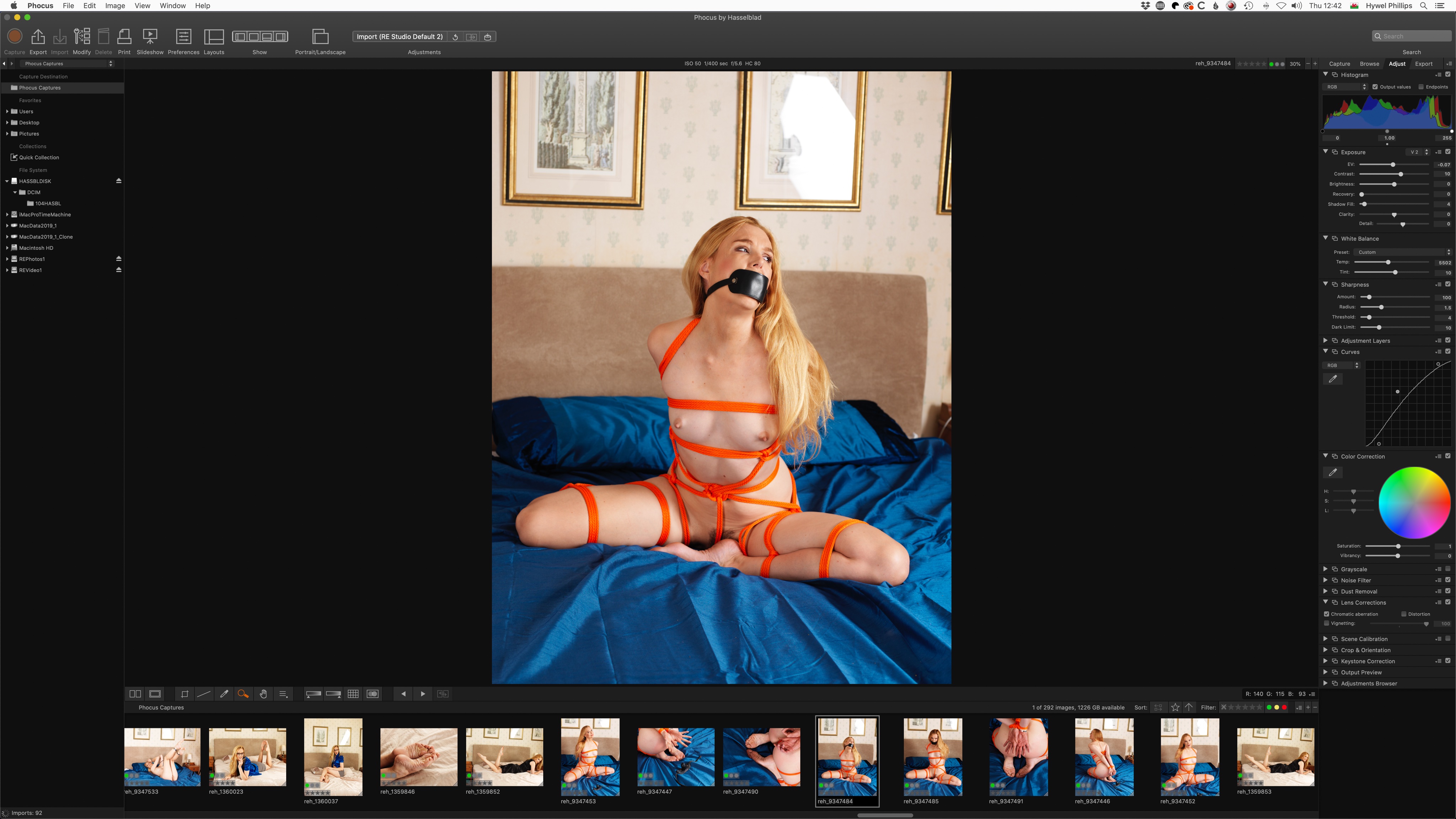
For the last decade or more, my Hasselblad has been the workhorse camera for the site. It perfected the “RE look” with very clean, crisp images, studio lighting, and bold colours. For the last five years or more I’ve been experimenting with adding other looks to my armoury, but the core aesthetic of the site is definitely the one that culminated in the Hasselblad (after 15 years of trying to perfect it with Canon dSLRs).
A couple of weeks ago I did a REALLY STUPID THING: I shouldered the Hasselblad’s rucksack without having done the zips up first. The camera landed nose-first on a concrete floor, and the 120 mm macro lens BOUNCED. Shudder. This kit originally cost me more than my car. Amazingly, it seems to have survived apart from a badly bent metal lens hood which took most of the impact.
But it made me realise that I no longer had a backup for the core RE look: I’ve sold all the old Canon dSLRs, and the Sonys excel at stuff like available light and shallow depth of field but just never quite achieve the crispness and purity of colour that the Hasselblad manages effortlessly. Realising this properly gave me the shakes – if that had happened on day one of a location trip, I might have really been in trouble.
Fortunately, there’s a happy ending. Hasselblad kit lasts forever (even if you drop it onto a concrete floor, seemingly) but its value does not. So I was able to acquire second-hand an H3Dii-50 (50 megapixels to complement Dave the Hasselblad’s 31 but with a faster sensor because of microlenses) and 80 mm and 120 mm lenses. It cost me £4000 which is a lot – the same as a new Sony mirrorless body- but which suddenly seems like an absolute BARGAIN compared with the original retail cost, which would have been ten times that! I must say, if you are a photographer and you like the crisp-clean-saturated look for studio work, go buy a second-hand Hasselblad kit. It won’t do what your modern mirrorless will do (eg Autofocus is really slow by comparison and you need to use focus-and-recompose – no fancy face recognition here) but for this one job, it still reigns supreme. I’m very much happier writing my kit list for our next location shoot knowing that this time I will have a proper spare.
Shoots!
Amidst all this upheaval, we’ve also tentatively resumed shoots with external models. We’ve just shot with Charlie Ten and Kitty Quinzell, and have more shoots coming up, COVID permitting.
Site revamp delayed
One thing I must apologise for is that all of this has delayed RE’s much-needed site revamp. I have a working version of the members’ home page in a new layout, but to be honest I’m not happy with it. It solves some of the current issues but to my mind introduces some new ones, and I stalled, not knowing how to solve those.
So plan B, once the current upheaval calms down a bit: I’m going update the current layout to remove some of the most egregious problems like the limited full-width display where content gets lost in the middle on a really big screen, and streamline and simplify some of the menu options. That will give me time to experiment with other layouts and see if I can come up with something that feels like an all-around improvement, rather than something which swaps current limitations for a bunch of new ones.
Right. Back to work uploading stuff to Clips4Sale before the deadline there.
Cheers, Hywel
