Thank you everyone who has replied to the survey about the site design and layout.
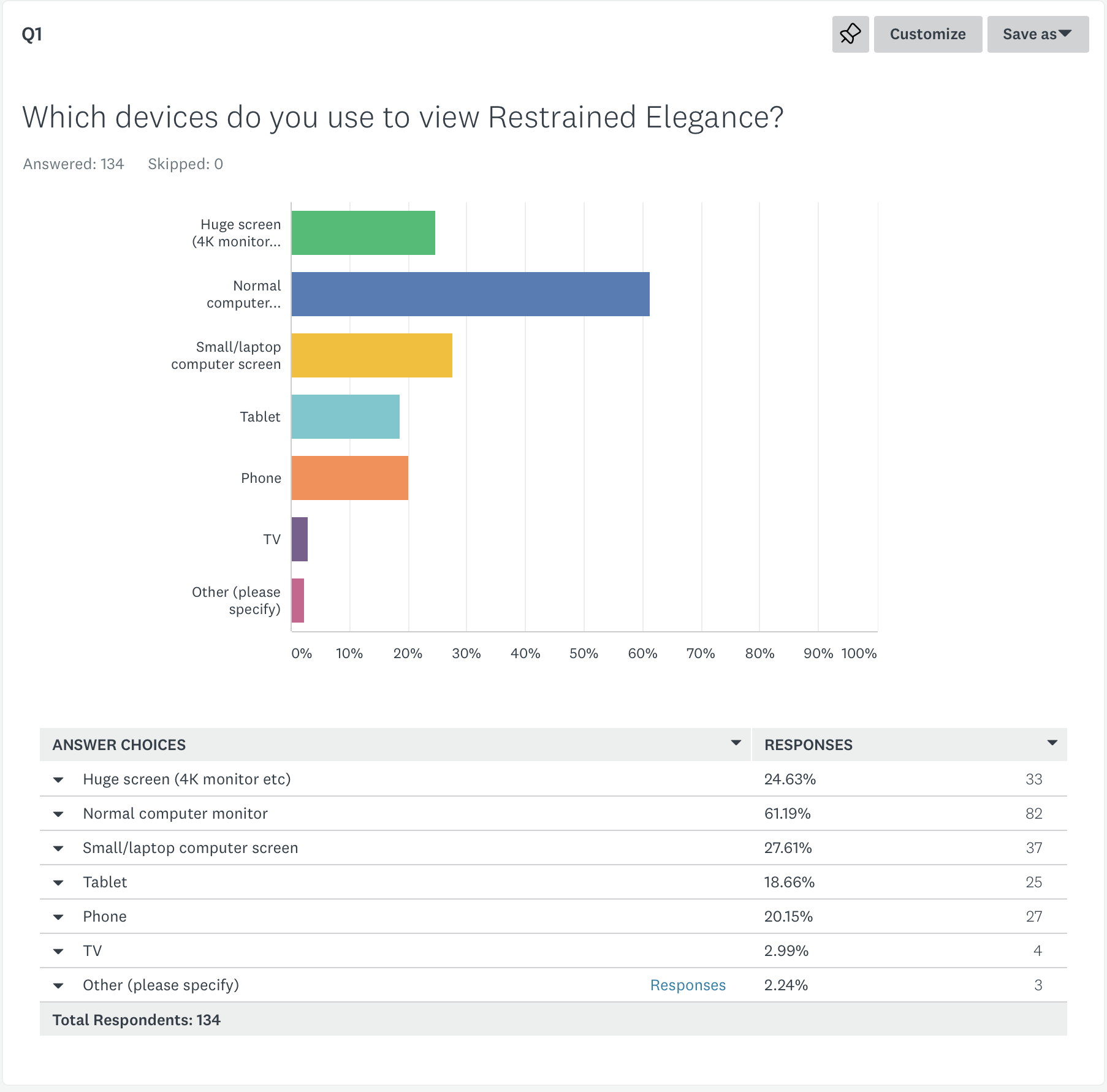
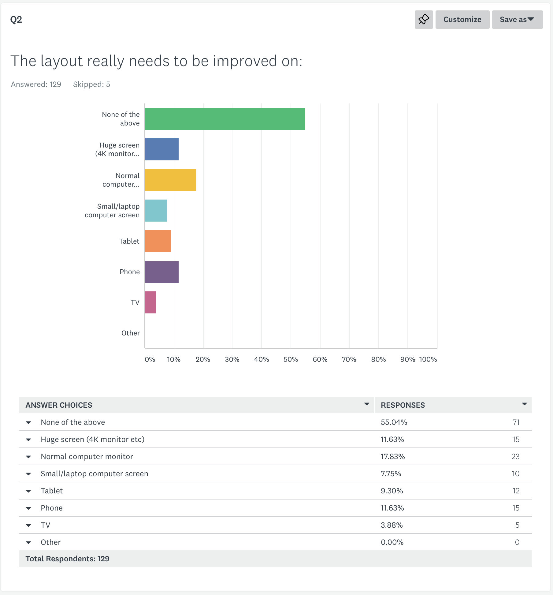
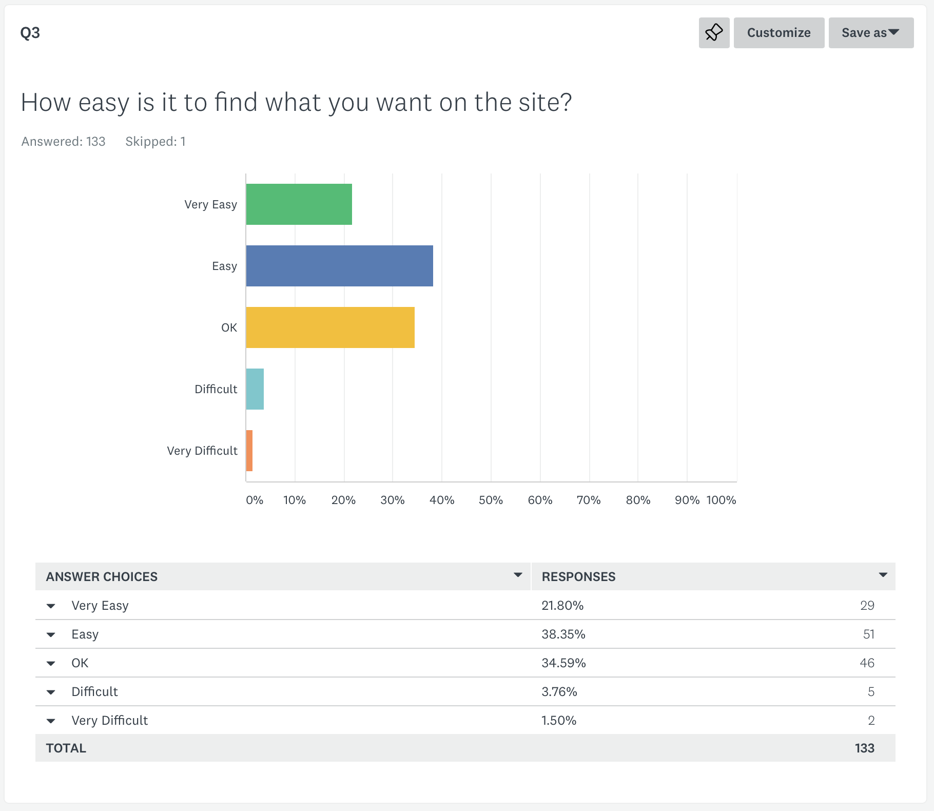
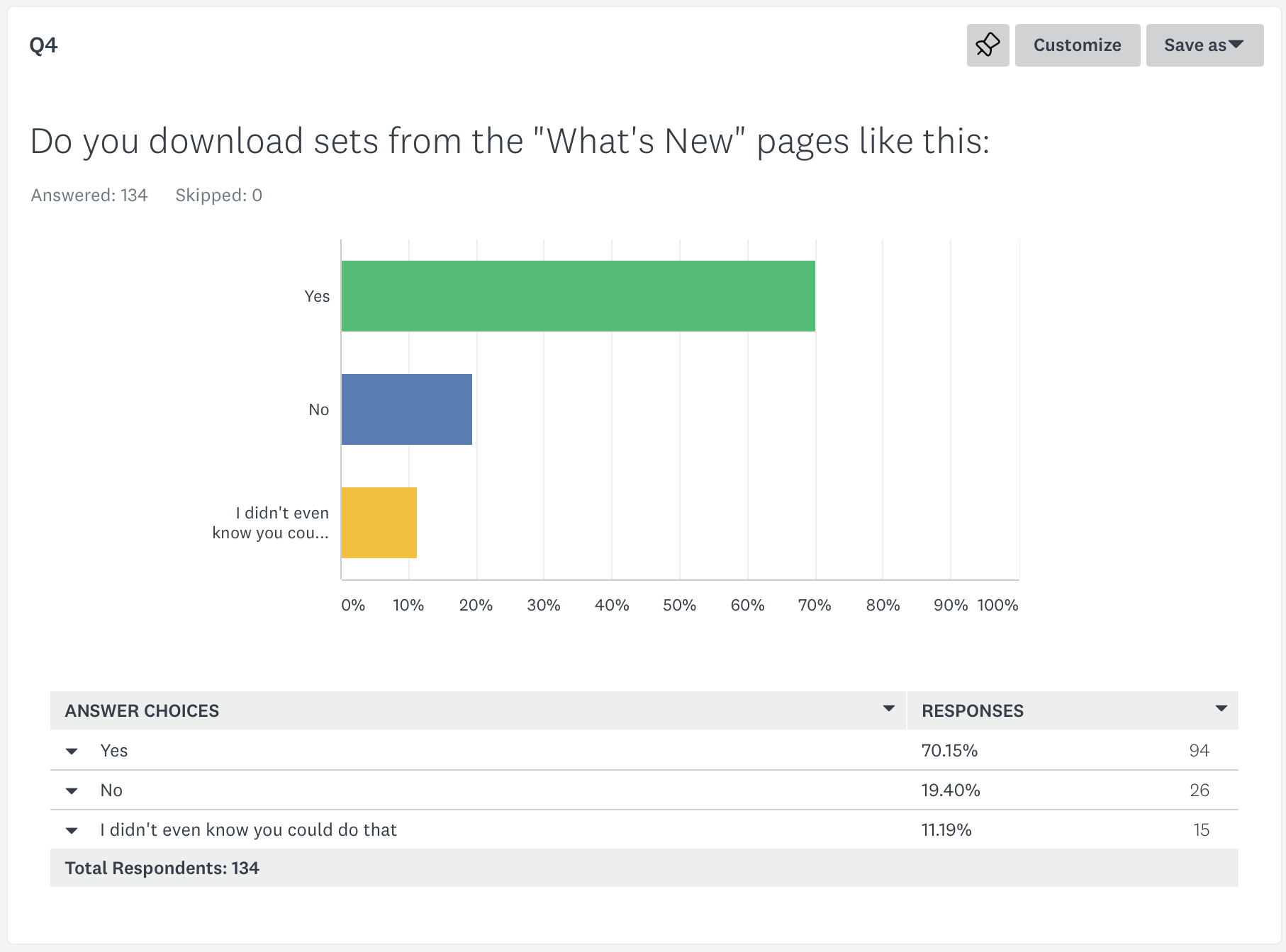
Here’s a summary of what people have said so far. I’ve added some thoughts below.
(Q7 and Q8 everybody answered No or Nothing, but many than gave comments which I’ll discuss below).
My Thoughts
Old web designer aphorism – don’t create the site you can build. Create the site you can maintain.
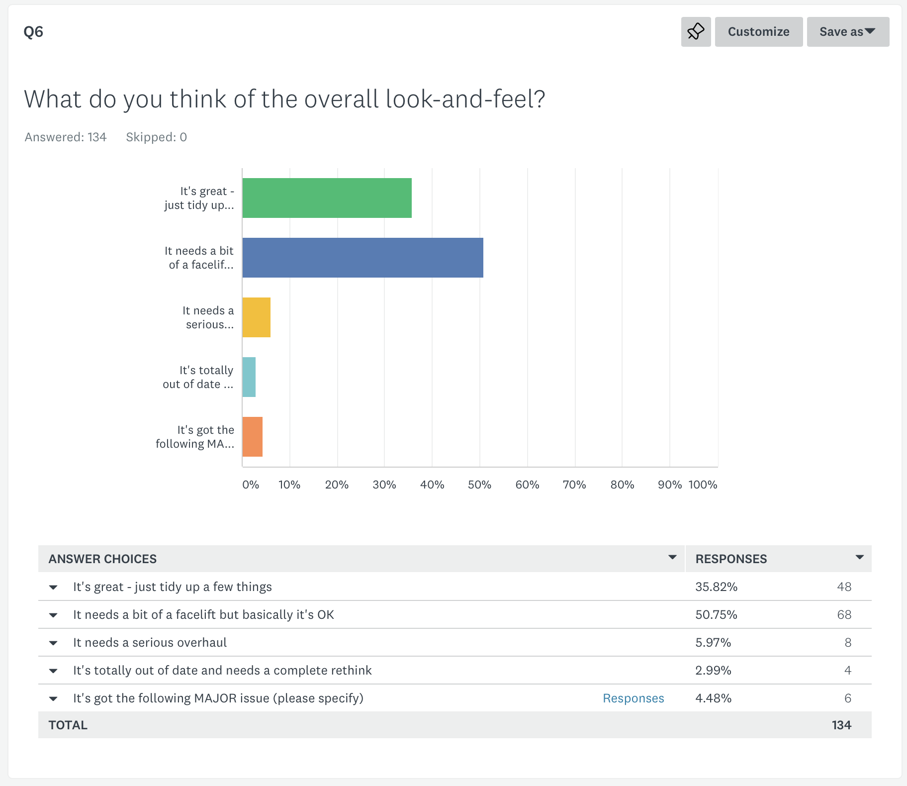
The first thing is that it is a big relief that I did a decent job of the site design last time I did this. The biggest relief is that people think the site layout is OK. Not perfect of course (how could it be?) but not so bad that it needs totally binning and starting again. The survey is self-selecting and I’m probably not catching any people in the survey who were so put off by the layout that they never bought anything, but at least I’ve got the core functionality covered.
A revamp, not a total redesign.
A lot of people mentioned that the site layout is clear and fast to load and navigate, before going on to describe changes they’d like to see. (A lot of which inevitably contradict each other). The number of times “clear” and “fast” came up mean I have to retain that in the revamp and improve it if I can. I will also restore crippled video pages etc.
which were removed when ATVOD were going to inspect us to try to avoid being classified as a TV-like service – this should clearly be reinstated or simply integrated into a better layout for search/whatsnew.
The current layout works OK on most devices. A more reactive layout to better accommodate big screens, without hindering use on smaller screens is worth doing. There are a few things to look at for phones, in particular, but it is the larger screens that people find less satisfactory in the comments. Not surprising given how long ago it was that I designed the max-width of all the layout and graphics!
Navigation can be improved and a clear message from the Q7/Q8 comments is improved site search and categorisation of sets so it is easier to find particular models, subjects, videos vs. stills, etc.. Integrating the advanced search, tags,
models into a better system. This is going to the heart of the redesign.
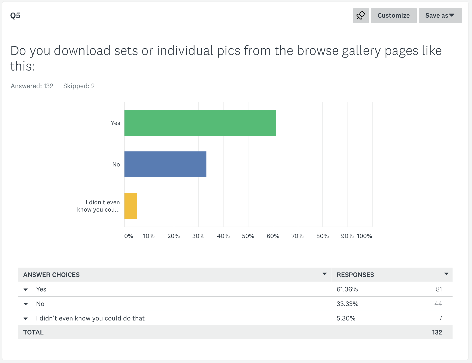
People use both the gallery pages and the whatsnew ZIP files to download. Which is good to know – I wasn’t sure how many people just clicked the ZIP file download and looked through them on their own machine (which is what I always do personally). Several people asked for things in the comments to facilitate online browsing of sets better, like “forward-backward” arrows when browsing a photo at a time or “click to download these images” – selecting particular images from a whole set to download. The first is certainly do-able so I will Investigate switching to a “browse gallery picture-by-picture” mechanism rather than links direct to the images.
The selection of multiple images to download partial sets involves too many temporary ZIP files and file manipulation for the site’s storage and processor capacities. The site can slow down notably when I am building all the ZIP files for the month’s updates, and I don’t think that’s going to be viable without some very clever programming or (more likely) a prohibitively expensive move to more powerful servers. So I’ll say no to that one, sorry.
More news about future updates and previews. I concur, I will do that.
Top ten lists very repetitive – I think I’ll probably remove them. People are using the ratings less and less anyway.
“Too many similar images per set”. I though this when the site started, and I used to spend quite a bit of time going through each set throwing away near-duplicates to retain just the best one. Then people started asking me why there were gaps in the file numbers, and asking me for the full sets. When I uploaded them, I discovered that not everyone agreed on what makes a “better” image – they might be looking for some detail that I don’t even see. So from then on I’ve had a policy of only removing images that are technically deficient. The number of near-duplicates varies very much with who’s doing the photography – Merlin hardly ever doubles up, Steve and I tend to take two or three of a nice pose to make sure we’ve got it, Faye stays in the same place but gets notably different expressions from the model even in the same pose, and Alexander Lightspear often takes multiple very similar shots. I think it just has to do with your rhythm of shooting. I probably can cull the Lightspear sets more if people want to, but honestly it’s not very much trouble to just keep everything that’s reasonably sharp so you can decide for yourselves which are your favourite shots.
“More videos, longer videos, only videos, video for every update”. Several people asked for this. We’re not going to do video for every update – it compromises both the stills and the video quality too much in my opinion. We’re often limited by the amount of time the model can stay in the bondage safely, and especially when there’s only me taking photos or filming the video, there’s no way of getting both to RE standards at the same time. Also, selfishly, stills are my first love and even if every other website switches to videos for everything I want to keep producing really high quality stills because I love them. But I do note the popularity of videos and the request for longer videos.
Improvements to the user interface for the billing system. Oh god, tell me about it. This, sadly, is out of my control – all things to do with memberships and billing are provided by the billing company. The reason I have stuck with the same company for over 15 years now is simple – the site uptime is 100% most months, they always pay me on time, and they do not impose the sort of restrictions on content and wording of set descriptions that the bigger platforms do. I really don’t want to lose the ability to say “damsel” or “distress” or “kidnapped” on the site. To give you and example of how pressing a problem this is, a new platform was about to open up recently, serving kinky content. They literally had their billing live for *A SINGLE DAY* before they lost it – even though they had had extensive discussions and agreements with their bank in place. The current system doesn’t have a nice interface at all. But the freedom of expression element (and the reliability) is important to me. On balance I’ve decided to stick with it for now at least.
More of the content available more of the time. Yeh, sorry. I’d love to but the economics don’t make sense. I need to make sure that the bandwidth charges for a member downloading everything when the join for a single month don’t exceed the membership fee. I also need to make sure that someone can’t pirate 20 years’ worth of content for $30. I also need to give people an incentive to stay as a member rather than joining once every two years and seeing everything (or put the prices up so a one-month membership pays for two years of content). So the current balance is, I think, pretty fair. Stay as a member and you see everything new, and eventually will see ALL the old material – but you can also buy the old stuff from the carts if you don’t want to wait.
A full model index of sets, even if not all sets are currently on the membership area. That’s an interesting idea, shouldn’t be too hard to implement, I just need to make sure I make it abundantly clear which sets are covered by an RE membership you purchase today and which aren’t. I guess my concern is that it might make website membership look like poor value – as the site is only ever going to have about 1/40th of the total sets up at any one time? But I can see that it would certainly help with the unfortunate division into old and new carts.
On which subject sadly while I’d love to port all 20 years of content into a newer cart system, the data entry alone makes that prohibitive to do. I looked at the feasibility and I’d have to hire someone full-time for a year to do it, unless we had full API access and could port stuff across. I hope that one of the newer platforms might allow us to do this, but so far the data entry on them all has been SLOWER, not faster, than the old ways of doing it, requiring interactive data input of every field for every update with no way of automating it at all. So for now sadly not feasible. So maybe the “master index” idea would provide a solution? Sets could pop up with a colour-coded bar to say where you can get them – this one is on the members’ area right now, this one is on the new eStore cart, this one is on the old eStore cart. That should be ease to automate, too.
Several people disliked the paged “What’s New”. I don’t want to switch to infinite scrolling, as it can get very hard to access older sets that way. (It’s one of my pet hates for OnlyFans). But I think a grid option for what’s new would go a long way to address that and several other requests for more stuff per page, fewer words, etc.. Likely have an option to switch between the “with words” style similar to the current way and a “collapsed grid” layout similar to the current search output.
Thank you everyone, I have a much clearer idea in my head of the pages I want to provide and how to organise them now!
Cheers, Hywel
Let me throw in a “Keep the stills” as a counterweight to the “more video” responses – I didn’t realize I needed to when I took the survey.
Thank you. It is good to know that I’m not alone in my fondness for stills!
While I enjoy all of the content, I have some favorite models that I enjoy the most. I will sometimes let my membership lapse and then return when there is new content from a favorite model. One potential feature you might consider would be a way to mark favorite models and then 1) Be able to opt-in to email notifications when a new set (or an archive set) from them is posted and 2) Perhaps use the favorite model votes to aid you in determining who to book more frequently or who to publish from the archives. I think the newsletter does an okay job of letting me know when new content is available and you probably have other ways of determining model popularity, but just thought I’d share the idea!
Thanks! That’s an interesting idea, I’ll see if there’s anything clever I can think of to help automate the process there.
Me too on the stills point, I love the still photography!
Regarding the question of all your content being downloaded by someone with a 1 month subscription, and/or making a recurring subscription more attractive, one site I’m a member of has a couple of things which they have implemented to address the problem (I have no idea how well they work, of course!):
* Restriction on number of concurrent downloads, so you can’t download everything at once
* Daily bandwidth cap (theirs is 5GB)
* Every month they publish extra content which is only available for that month. Stuff from the archives, behind the scenes, unseen footage, that kind of thing. If you’re a member that month you can download it, but if you want to see next month’s bonus content you need to keep your subscription.
Might be worth considering, just as other ways of skinning the cat!
Thanks for your thoughts! I have considered the limited-download method of containing the bandwidth, but on balance I prefer the freshness of daily archives (a lot of people have said they’ve discovered sets that would have just been lost amongst the almost 6000 updates otherwise). I also like the simplicity of “you can download everything that’s on the member’s site right now”.
I’ll keep it under review, but that’s not something I’m planning to change for the moment.